Hyp-Arch Design Co., Ltd. (Shanghai)

Design Focus: Commercial Architecture Company
Design Year: 2017 (HYP)
Brand Location: Shanghai
Brand Style: Commercial Development

HYP New Logo Public Account Release Video

The new logo of Hyp-Arch Design Co., Ltd. draws inspiration from the most common columnar elements found in architectural expression. It combines this with the origin of the Hopu brand name, derived from the English word “hyper,” meaning “excited.” By merging the letters with the graphic form and applying transformations and detailed processing, the logo conveys a new brand connotation.

Architectural Weather Vane

Hyp-Arch Design Co., Ltd. New Logo Inspiration Diagram

From a semantic perspective, the logo expresses Hopu’s deep passion for architectural design, always pursuing higher realms of architecture with an excited and enthusiastic attitude.

From a details standpoint, the square and solid lines symbolize the foundation of architecture, representing Hopu’s integrity and the robust operational strength of the company.

In terms of shape, the design is inspired by the form of a weather vane, reflecting Hopu’s spirit of continuous exploration, determination, and ambition to be a guiding force in the field of architectural design.

Proportion Division Diagram

Proportions and Colors

The new logo follows the golden ratio, showcasing strict proportions, artistry, and harmony, embodying rich aesthetic value.This design proportion provides an intuitive sense of beauty, representing the most ideal ratio in architecture and art.

Color Usage Standards

As an architectural design company and a communicator of architectural language, HYP’s new logo avoids flashy and complex color clashes, opting instead for the most straightforward color scheme.

About Details

The primary color, “HYP Green,” symbolizes endless design innovation and corporate vitality, reflecting Hopu’s commitment to creating more green and environmentally friendly architecture to enhance living experiences.

Color Details​

The secondary color, blue, symbolizes a return to origins and endless imagination, reflecting Hopu’s pioneering spirit in exploring new architectural frontiers.

Font Usage Standards​​

Font usage standards should be simple, elegant, and bold.

The alternating blue and green colors, combined with a natural gradient, depict a hopeful and vibrant future for HYP.

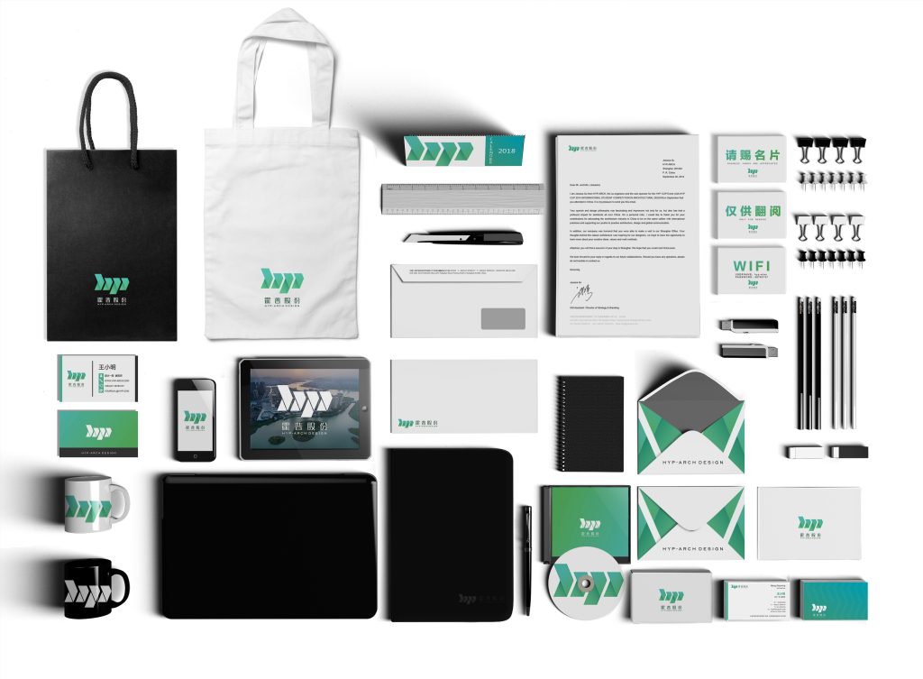
Brand Merchandise

Hyp-Arch Design Co., Ltd. New Brand Merchandise

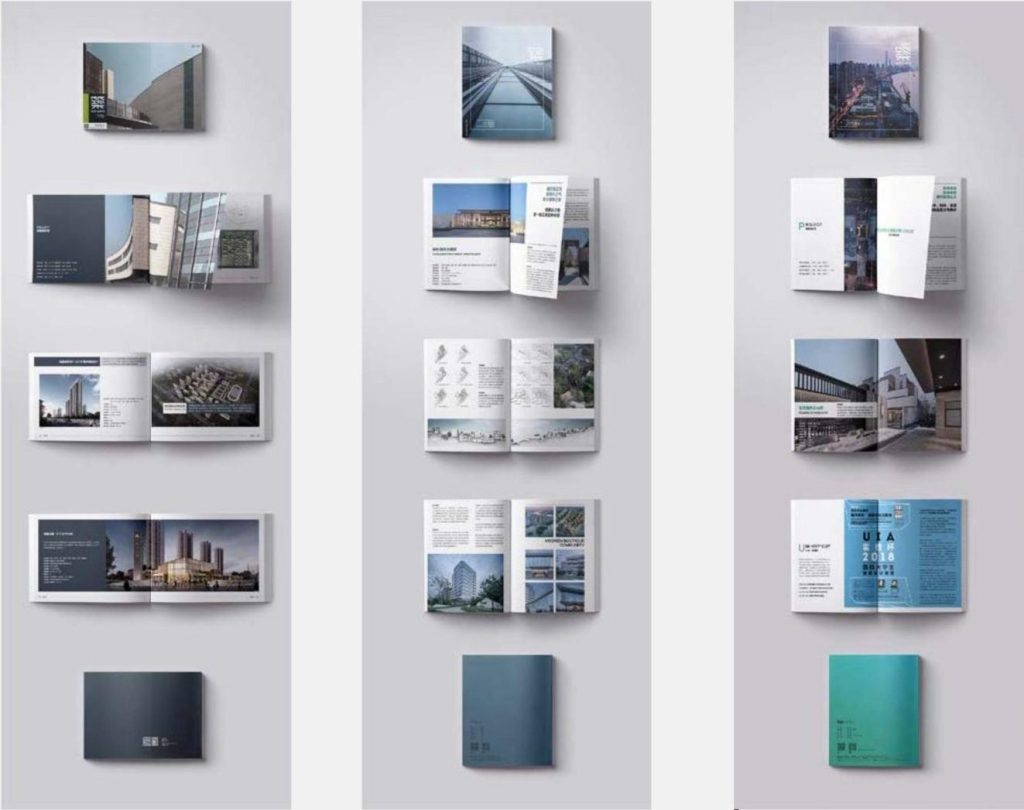
Hyp-Arch Magazine

Copyright © 2024 Lusa Yue. Powered by Lusa Yue

滚动至顶部